What is a graph or chart?
A chart is usually a presentation of a large set of data graphically. It can easily make people understand information since people can infer meaning quickly from pictures than from text.
A graph is also a type of chart that plots mostly numerical data along two dimensions through a line, curve, etc. using horizontal line(called X-axis) and vertical line (called Y-axis). When we plot data to make a chart, the known value goes on the one-axis and the measured value goes on the other axis.
There are different types of graphs for data visualization.
Bar graph:
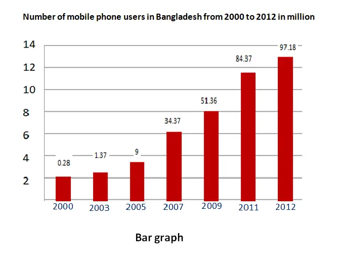
A bar graph is a graph with rectangular bars where the lengths of the bar is proportional to the values. When you plot a bar graph, the known value goes on one axis and the measured value along the other axis.
For example, if you plot the measured number of mobile phone users for different years, you will get the bar graph as shown below in the picture.
Pie chart:
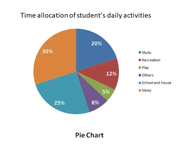
A pie chart is a type of circular chart in which a circle is divided into sectors representing a proportion of the whole. Here each segment of the pie chart is always a percentage of the whole. Total is considered 100%.
From the pie chart, we can learn how the whole break down into parts. For example, a pie chart given below shows the amount of time that a student spends each day on various activities.
Line graph:
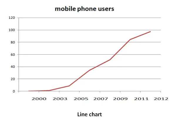
A line graph is a graph that shows how data of two variables relate to one another and changes, particularly over time.
How to Describe a Graph/chart effectively
It is an important skill to be able to understand and describe graphic information. A picture or graph can represent a thousand words. It conveys different data around a topic which is resulted from a survey or research. It is a student’s talent to collect data and ideas from the graph or chart to write a description on the topic within a word limit. But many students don’t know how to describe a graph or chart effectively. So this is a small effort today.
Here are four steps to describe a graph or chart effectively.
- Introduce the graph
- Describe the graph details
- Make a short comparison
- Write a conclusion
Introduce the graph/chart:
You need to start writing with one or two sentences to introduce the graph briefly. You should state here, in fact, what the graph shows and what you see at a glance according to the title.
Describe the graph/chart details:
It is the body of the whole writing task. Here you can present the details of the data mentioned in the horizontal vs. vertical line of the graph. Also, you can mention the axis label and the trend of the graph in the description.
Make a short comparison
Before you write a conclusion you can briefly present a comparative discussion between the focused data presented in the graph.
Write a conclusion
You need to write one or two sentences here to summarize or draw a conclusion.
Instruction for the best writing:
1. Use introduction, body, and conclusion in your writing.
2. Accurately collect data and ideas from the graph or chart and make a report on them.
3. You need to use handy connectors to make a flow of your paragraph.
4. Use a range of appropriate vocabulary.
5. Try to meet the word limit requirements.
6. Focus on the important trend presented in the graphic information.
7. Pay attention to spelling, grammar, and punctuation.
Related term :
Describe a chart on internet users in Bangladesh
Describe a graph on the choice of profession by different educated person.