Question :
Describe a graph showing the choice of profession by different educated people in 150 words. You should highlight and summarize the information given in the graph.
Answer :
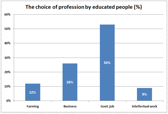
Choice of profession by different educated person
The graph here gives us information on the choice of professions by different educated people. We find here four categories of jobs against the percentage of different educated people. The categories of the jobs are farming, business, govt. job and intellectual works.
At first glance, we see that govt. job has occupied the pick position in the graph. About 53% of educated people prefer this job as their profession. The reason is that Govt. job is more secured and prestigious than any other jobs. Business category has occupied the second position in the graph. About 26% of the people choose business as their profession. Though Bangladesh is an agricultural country, only 12% of educated people select farming as their profession. Farming has occupied the third position in the graph. The reason may be this job is thought to be laborious and disreputable. For that reason, fewer percentage of educated people are interested to choose this profession. On the other hand, only 9% of the educated people are interested to do intellectual work as their profession. The interest of the educated people drops off in selecting intellectual works since these jobs are less paid in most cases.
Overall, the graph shows the high trend of the educated people for preferring govt job and less trend for choosing other professions. But there is no guarantee of ensuring govt jobs for all. So, it would be better if the educated people moved to the farming and intellectual works for proceeding national progress.
Related term :