Describe the pie chart showing the percentage of a family’s household income distributed into different categories.
Answer 1: 120 words
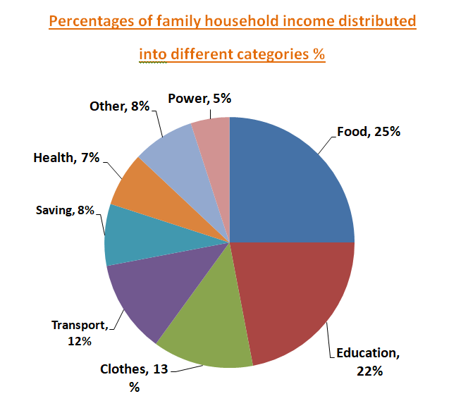
This pie chart shows the percentages of household income distributions into different categories. The categories are food items, clothes, education, and health, and transport, power consumption, saving, and other things.
From the chart, we find that the family spends 25% of income on food items, 13% on clothes, 22% on education and 7% on health. It is also found that the family spends 5 % on power consumption, 12% on transport and 8% on savings.
In conclusion, the family reasonably spends income on the various needs. They spend the highest percentage on food items and the second-highest on education. Moreover, they save 8% of their income for the future. It proves that the family is passionate about education and thinks about the future.
Answer 2: 136 words
This pie chart illustrates the survey result conducted on the percentages of household income distributed into different categories. The categories here include food items, clothes, education, and health, and transport, power consumption, saving, and other things.
A glance at the chart reveals that household income distribution covers 25% for food items, 13% for clothes, 22% for education, and 7% for health. It is also found that the family spends 5 % on power consumption, 12% on transport and 8% on savings. They also keep 8% income for other expenditures as required.
Overall, the trend of spending money inferred from the chart clears that the family is balancing its expenditure against household income. The highest distribution of income goes for food items and the second-highest goes for education. Also, the family preserves a reasonable amount for the future.
Answer 3: 150 words
This pie chart depicts the percentages of household income distributions into different categories. The categories mentioned in the chart are food items, clothes, education, health, transport, power consumption, savings, and other things.
From this chart, it is visible that, the family distributes the percentages of income like 25%, 13%, and 22% into basic things including food items, clothes, and education purposes respectively. Moreover, the family’s household income covers 12% for transport, 7% for health issues, and 8% for other things. The family is aware of the future and keeps an extra 8% of income for saving.
However, as indicated from the chart, the family is a balanced one, since it distributes income into different household needs reasonably. The highest distribution of income goes for food items which are 25%. The second highest distribution goes for education and it is 22%. The family is supposed to be happy with these reasonable consumptions.
Related :
Describe a graph chart on the internet users
Describe the chart of the choice of profession by different educated people